Consume XAML markup extensions
.NET Multi-platform App UI (.NET MAUI) XAML markup extensions help enhance the power and flexibility of XAML by allowing element attributes to be set from a variety of sources.
For example, you typically set the Color property of BoxView like this:
<BoxView Color="Blue" />
However, you might prefer instead to set the Color attribute from a value stored in a resource dictionary, or from the value of a static property of a class that you've created, or from a property of type Color of another element on the page, or constructed from separate hue, saturation, and luminosity values. All these options are possible using XAML markup extensions.
A markup extension is a different way to express an attribute of an element. .NET MAUI XAML markup extensions are usually identifiable by an attribute value that is enclosed in curly braces:
<BoxView Color="{StaticResource themeColor}" />
Any attribute value in curly braces is always a XAML markup extension. However, XAML markup extensions can also be referenced without the use of curly braces.
Note
Several XAML markup extensions are part of the XAML 2009 specification. These appear in XAML files with the customary x namespace prefix, and are commonly referred to with this prefix.
In addition to the markup extensions discussed in this article, the following markup extensions are included in .NET MAUI and discussed in other articles:
AppThemeBinding- specifies a resource to be consumed based on the current system theme. For more information, see AppThemeBinding markup extension.Binding- establishes a link between properties of two objects. For more information, see Data binding.DynamicResource- responds to changes in objects in a resource dictionary. For more information, see Dynamic styles.FontImage- displays a font icon in any view that can display an ImageSource. For more information, see Load a font icon.OnIdiom- customizes UI appearance based on the idiom of the device the application is running on. For more information, see Customize UI appearance based on the device idiom.OnPlatform- customizes UI appearance on a per-platform basis. For more information, see Customize UI appearance based on the platform.RelativeSource- sets the binding source relative to the position of the binding target. For more information, see Relative bindings.StaticResource- references objects from a resource dictionary. For more information, see Resource dictionaries.TemplateBinding- performs data binding from a control template. For more information, see Control templates.
x:Static markup extension
The x:Static markup extension is supported by the StaticExtension class. The class has a single property named Member of type string that you set to the name of a public constant, static property, static field, or enumeration member.
One way to use x:Static is to first define a class with some constants or static variables, such as this AppConstants class:
static class AppConstants
{
    public static double NormalFontSize = 18;
}
The following XAML demonstrates the most verbose approach to instantiating the StaticExtension class between Label.FontSize property-element tags:
<ContentPage xmlns="http://schemas.microsoft.com/dotnet/2021/maui"
             xmlns:x="http://schemas.microsoft.com/winfx/2009/xaml"
             xmlns:sys="clr-namespace:System;assembly=netstandard"
             xmlns:local="clr-namespace:MarkupExtensions"
             x:Class="MarkupExtensions.StaticDemoPage"
             Title="x:Static Demo">
    <StackLayout Margin="10, 0">
        <Label Text="Label No. 1">
            <Label.FontSize>
                <x:StaticExtension Member="local:AppConstants.NormalFontSize" />
            </Label.FontSize>
        </Label>
        ···
    </StackLayout>
</ContentPage>
The XAML parser also allows the StaticExtension class to be abbreviated as x:Static:
<Label Text="Label No. 2">
    <Label.FontSize>
        <x:Static Member="local:AppConstants.NormalFontSize" />
    </Label.FontSize>
</Label>
This syntax can be simplified even further by putting the StaticExtension class and the member setting in curly braces. The resulting expression is set directly to the FontSize attribute:
<Label Text="Label No. 3"
       FontSize="{x:StaticExtension Member=local:AppConstants.NormalFontSize}" />
In this example, there are no quotation marks within the curly braces. The Member property of StaticExtension is no longer an XML attribute. It is instead part of the expression for the markup extension.
Just as you can abbreviate x:StaticExtension to x:Static when you use it as an object element, you can also abbreviate it in the expression within curly braces:
<Label Text="Label No. 4"
       FontSize="{x:Static Member=local:AppConstants.NormalFontSize}" />
The StaticExtension class has a ContentProperty attribute referencing the property Member, which marks this property as the class's default content property. For XAML markup extensions expressed with curly braces, you can eliminate the Member= part of the expression:
<Label Text="Label No. 5"
       FontSize="{x:Static local:AppConstants.NormalFontSize}" />
This is the most common form of the x:Static markup extension.
The root tag of the XAML example also contains an XML namespace declaration for the .NET System namespace. This allows the Label font size to be set to the static field Math.PI. That results in rather small text, so the Scale property is set to Math.E:
<Label Text="π × E sized text"
FontSize="{x:Static sys:Math.PI}"
Scale="{x:Static sys:Math.E}"
HorizontalOptions="Center" />
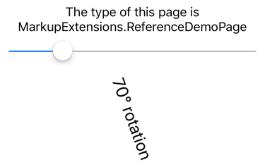
The following screenshot shows the XAML output:

x:Reference markup extension
The x:Reference markup extension is supported by the ReferenceExtension class. The class has a single property named Name of type string that you set to the name of an element on the page that has been given a name with x:Name. This Name property is the content property of ReferenceExtension, so Name= is not required when x:Reference appears in curly braces. The x:Reference markup extension is used exclusively with data bindings. For more information about data bindings, see Data binding.
The following XAML example shows two uses of x:Reference with data bindings, the first where it's used to set the Source property of the Binding object, and the second where it's used to set the BindingContext property for two data bindings:
<ContentPage xmlns="http://schemas.microsoft.com/dotnet/2021/maui"
xmlns:x="http://schemas.microsoft.com/winfx/2009/xaml"
x:Class="MarkupExtensions.ReferenceDemoPage"
x:Name="page"
Title="x:Reference Demo">
<StackLayout Margin="10, 0">
<Label Text="{Binding Source={x:Reference page},
StringFormat='The type of this page is {0}'}"
FontSize="18"
VerticalOptions="Center"
HorizontalTextAlignment="Center" />
<Slider x:Name="slider"
Maximum="360"
VerticalOptions="Center" />
<Label BindingContext="{x:Reference slider}"
Text="{Binding Value, StringFormat='{0:F0}° rotation'}"
Rotation="{Binding Value}"
FontSize="24"
HorizontalOptions="Center"
VerticalOptions="Center" />
</StackLayout>
</ContentPage>
In this example, both x:Reference expressions use the abbreviated version of the ReferenceExtension class name and eliminate the Name= part of the expression. In the first example, the x:Reference markup extension is embedded in the Binding markup extension and the Source and StringFormat properties are separated by commas.
The following screenshot shows the XAML output:

x:Type markup extension
The x:Type markup extension is the XAML equivalent of the C# typeof keyword. It's supported by the TypeExtension class, which defines a property named TypeName of type string that should be set to a class or structure name. The x:Type markup extension returns the Type object of that class or structure. TypeName is the content property of TypeExtension, so TypeName= is not required when x:Type appears with curly braces.
The x:Type markup extension is commonly used with the x:Array markup extension. For more information, see x:Array markup extension.
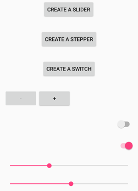
The following XAML example demonstrates using the x:Type markup extension to instantiate .NET MAUI objects and add them to a StackLayout. The XAML consists of three Button elements with their Command properties set to a Binding and the CommandParameter properties set to types of three .NET MAUI views:
<ContentPage xmlns="http://schemas.microsoft.com/dotnet/2021/maui"
             xmlns:x="http://schemas.microsoft.com/winfx/2009/xaml"
             x:Class="MarkupExtensions.TypeDemoPage"
             Title="x:Type Demo">
    <StackLayout x:Name="stackLayout"
                 Padding="10, 0">
        <Button Text="Create a Slider"
                HorizontalOptions="Center"
                VerticalOptions="Center"
                Command="{Binding CreateCommand}"
                CommandParameter="{x:Type Slider}" />
        <Button Text="Create a Stepper"
                HorizontalOptions="Center"
                VerticalOptions="Center"
                Command="{Binding CreateCommand}"
                CommandParameter="{x:Type Stepper}" />
        <Button Text="Create a Switch"
                HorizontalOptions="Center"
                VerticalOptions="Center"
                Command="{Binding CreateCommand}"
                CommandParameter="{x:Type Switch}" />
    </StackLayout>
</ContentPage>
The code-behind file defines and initializes the CreateCommand property:
public partial class TypeDemoPage : ContentPage
{
    public ICommand CreateCommand { get; private set; }

    public TypeDemoPage()
    {
        InitializeComponent();

        CreateCommand = new Command<Type>((Type viewType) =>
        {
            View view = (View)Activator.CreateInstance(viewType);
            view.VerticalOptions = LayoutOptions.Center;
            stackLayout.Add(view);
        });

        BindingContext = this;
    }
}
When a Button is pressed a new instance of the CommandParameter argument is created and added to the StackLayout. The three Button objects then share the page with dynamically created views:

x:Array markup extension
The x:Array markup extension enables you to define an array in markup. It is supported by the ArrayExtension class, which defines two properties:
Typeof typeType, which indicates the type of the elements in the array. This property should be set to anx:Typemarkup extension.Itemsof typeIList, which is a collection of the items themselves. This is the content property of ArrayExtension.
The x:Array markup extension itself never appears in curly braces. Instead, x:Array start and end tags delimit the list of items.
The following XAML example shows how to use x:Array to add items to a ListView by setting the ItemsSource property to an array:
<ContentPage xmlns="http://schemas.microsoft.com/dotnet/2021/maui"
             xmlns:x="http://schemas.microsoft.com/winfx/2009/xaml"
             x:Class="MarkupExtensions.ArrayDemoPage"
             Title="x:Array Demo Page">
    <ListView Margin="10">
        <ListView.ItemsSource>
            <x:Array Type="{x:Type Color}">
                <Color>Aqua</Color>
                <Color>Black</Color>
                <Color>Blue</Color>
                <Color>Fuchsia</Color>
                <Color>Gray</Color>
                <Color>Green</Color>
                <Color>Lime</Color>
                <Color>Maroon</Color>
                <Color>Navy</Color>
                <Color>Olive</Color>
                <Color>Pink</Color>
                <Color>Purple</Color>
                <Color>Red</Color>
                <Color>Silver</Color>
                <Color>Teal</Color>
                <Color>White</Color>
                <Color>Yellow</Color>
            </x:Array>
        </ListView.ItemsSource>
        <ListView.ItemTemplate>
            <DataTemplate>
                <ViewCell>
                    <BoxView Color="{Binding}"
                             Margin="3" />
                </ViewCell>
            </DataTemplate>
        </ListView.ItemTemplate>
    </ListView>
</ContentPage>
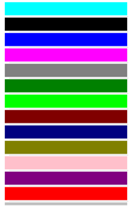
In this example, the ViewCell creates a simple BoxView for each color entry:

Note
When defining arrays of common types like strings or numbers, use the XAML language primitives tags listed in Pass arguments.
x:Null markup extension
The x:Null markup extension is supported by the NullExtension class. It has no properties and is simply the XAML equivalent of the C# null keyword.
The following XAML example shows how to use the x:Null markup extension:
<ContentPage xmlns="http://schemas.microsoft.com/dotnet/2021/maui"
             xmlns:x="http://schemas.microsoft.com/winfx/2009/xaml"
             x:Class="MarkupExtensions.NullDemoPage"
             Title="x:Null Demo">
    <ContentPage.Resources>
        <Style TargetType="Label">
            <Setter Property="FontSize" Value="48" />
            <Setter Property="FontFamily" Value="OpenSansRegular" />
        </Style>
    </ContentPage.Resources>

    <StackLayout Padding="10, 0">
        <Label Text="Text 1" />
        <Label Text="Text 2" />
        <Label Text="Text 3"
               FontFamily="{x:Null}" />
        <Label Text="Text 4" />
        <Label Text="Text 5" />
    </StackLayout>
</ContentPage>
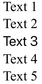
In this example, an implicit Style is defined for Label that includes a Setter that sets the FontFamily property to a specific font. However, the third Label avoids using the font defined in the implicit style by setting its FontFamily to x:Null:

DataTemplate markup extension
The DataTemplate markup extension enables you to convert a type into a DataTemplate. It's supported by the DataTemplateExtension class, which defines a TypeName property, of type string, that is set to the name of the type to be converted into a DataTemplate. The TypeName property is the content property of DataTemplateExtension. Therefore, for XAML markup expressions expressed with curly braces, you can eliminate the TypeName= part of the expression.
Note
The XAML parser allows the DataTemplateExtension class to be abbreviated as DataTemplate.
A typical usage of this markup extension is in a Shell application, as shown in the following example:
<ShellContent Title="Monkeys"
              Icon="monkey.png"
              ContentTemplate="{DataTemplate views:MonkeysPage}" />
In this example, MonkeysPage is converted from a ContentPage to a DataTemplate, which is set as the value of the ShellContent.ContentTemplate property. This ensures that MonkeysPage is only created when navigation to the page occurs, rather than at application startup.
For more information about Shell apps, see Shell.
Feedback
Coming soon: Throughout 2024 we will be phasing out GitHub Issues as the feedback mechanism for content and replacing it with a new feedback system. For more information see: https://aka.ms/ContentUserFeedback.
Submit and view feedback for
 Browse the sample