FactBox form patterns
This article provides information about the FactBox form patterns. FactBoxes are used to provide related information for a record.
Usage
In general, FactBoxes are used to provide “related information” for a record. They help guarantee that the user doesn't have to open additional forms to get important information, such as totals, balances, overdue orders, and email addresses. The Factbox Grid pattern should be used when there is a child collection (potential for multiple rows) of related information. Two patterns are described in this document:
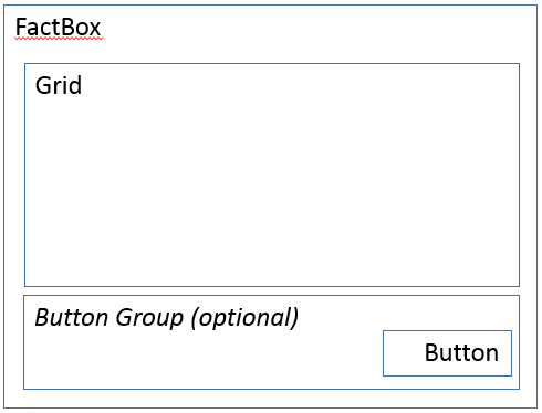
- Form Part FactBox Grid – This FactBox pattern is used when there is a child collection (potential for multiple rows) of related information.
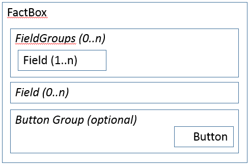
- Form Part FactBox Card – This FactBox pattern is used when there is just a set of related fields that must be shown.
Wireframe
Form Part FactBox Grid
Form Part FactBox Card
Pattern changes
Here are the main changes to this pattern since Microsoft Dynamics AX 2012:
- A group has been added around the optional button to make it easier to position the button.
Model
Form Part FactBox Grid – High-level structure
Design
Grid
GridDefaultAction (Button) [Optional]
ButtonGroup (ButtonGroup) [Optional]
- Button
Form Part FactBox Card – High-level structure
Design
FieldGroups (Group) [0..N]
- Fields ($Fields, 1..N)
Fields ($Field) [0..N]
ButtonGroup (ButtonGroup) [Optional]
- Button
Core components
- Apply the FactBox pattern on Form.Design.
- Address BP Warnings:
- Design.Caption isn't empty.
- Grid.DataSource isn't empty.
UX guidelines
The verification checklist shows the steps for manually verifying that the form complies with UX guidelines. This checklist doesn't include any guidelines that will be enforced automatically through the development environment. Open the form in the browser, and walk through these steps. Standard form guidelines:
- Standard form guidelines have been consolidated into the General Form Guidelines document.
FactBox general guidelines:
- If a backing form exists, the FactBox should have a (More…) link defined that goes to the appropriate backing form. The names of the FactBox and backing form should be similar.
- The title should not be a verb or a verb phrase.
- The title should not contain a label to a specific record.
- FactBoxes should not display fields that let a user enter data by typing with the keyboard.
- The title should accurately describe the content and should not be truncated when the FactBox area is at its default size.
FactBox grid guidelines:
- One to four columns should be displayed.
FactBox card guidelines:
- Each field should have a label.
- The ID and name of the header or the line that content is displayed for in the FactBox should not be displayed.
- Two to ten fields should be displayed.
- Currency indicator fields should be displayed as the last field in the FactBox.
Examples
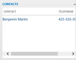
Form Part FactBox Grid
Form: CustTable > ContactsInfoPart
Form Part FactBox Card
Form: CustTable > CustStatisticsStatistics
Appendix
Frequently asked questions
This section will have answers to frequently asked questions that are related to this guideline/pattern.
- How do I make the More button work?
The More button at the bottom of the FactBox takes the user to a backing form that contains the full list of related records. This button should be implemented by using a regular Button control that overrides the clicked method as shown in the following example. Be sure to fill in the TableRef and ListPageRef properties on the table that provides data for the grid.
[Control("Button")]
class More
{
public void clicked()
    {
        super();
        FormPartUtil::openShowMoreForm(element, <TableName>);
    }
}
Open issues
- Should field labels be on the left side in FactBoxes to support a more compact visual?
- We plan to allow LabelPosition=Left inside FactBoxes.
AX 2012 content
AX 2012 links
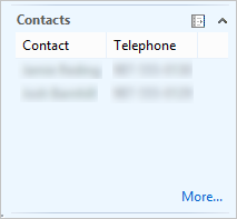
AX 2012 example
CustTable > ContactsInfoPart
Feedback
Coming soon: Throughout 2024 we will be phasing out GitHub Issues as the feedback mechanism for content and replacing it with a new feedback system. For more information see: https://aka.ms/ContentUserFeedback.
Submit and view feedback for


