Create and manage dashboards
The default organization dashboard is the page that loads when you first go to your application. As an administrator, you can create more organization dashboards that are associated with a specific organization. An organization dashboard is only visible to users who have access to the organization the dashboard is associated with. Only users in a role that has organization dashboard permissions can create, edit, and delete organization dashboards.
Tip
You can see which organization a dashboard is associated with in the dashboard settings.
All users can create personal dashboards, visible only to themselves. Users can switch between organization and personal dashboards.
Create a dashboard
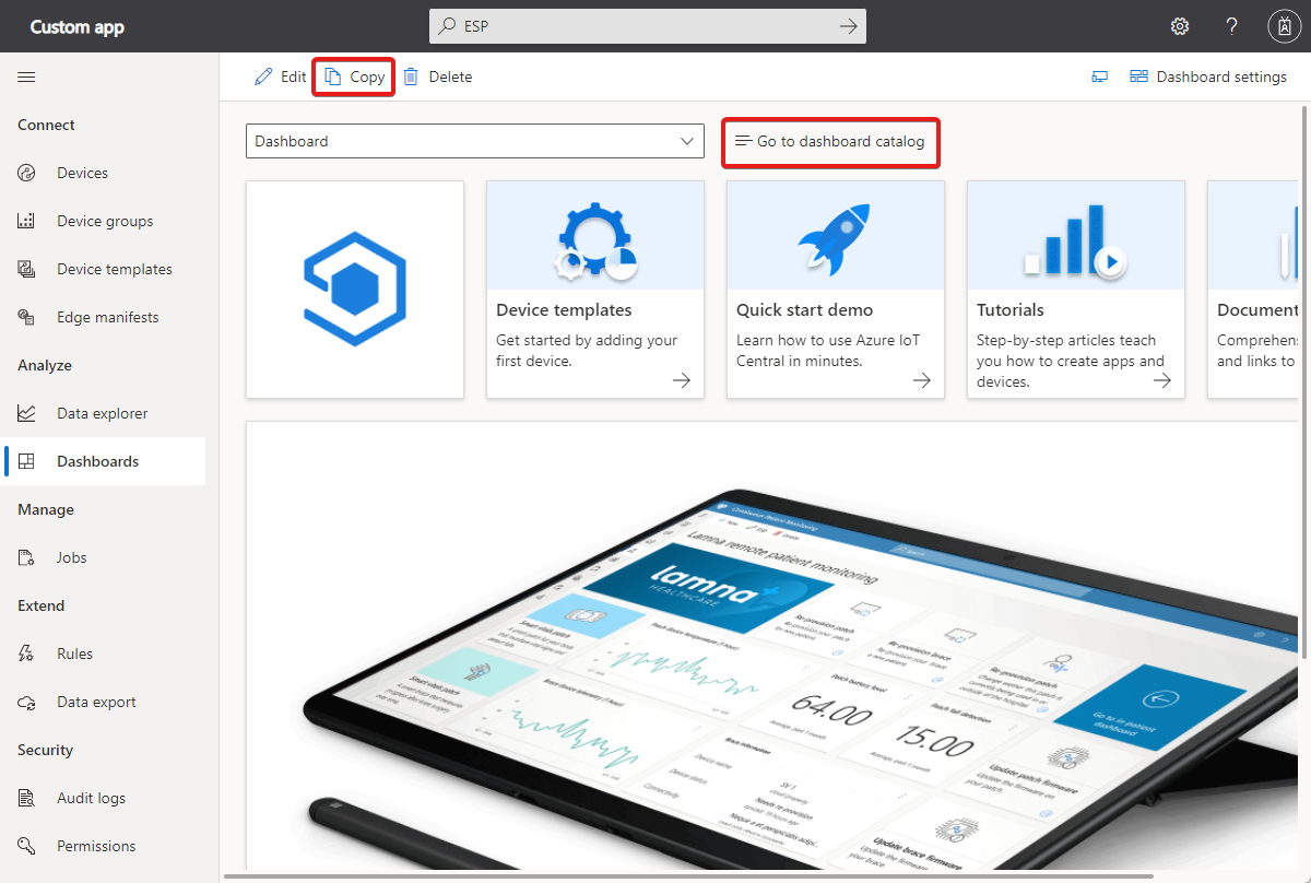
The following screenshot shows the dashboard in an application created from the Custom Application template. If you're in a role with the appropriate permissions, you can customize the default dashboard. To create a new dashboard from scratch, selectGo to dashboard catalog and then +New. To create a new dashboard by copying the current dashboard, select Copy:
In the Create dashboard or Duplicate dashboard panel, give your dashboard a name and select either Organization or Personal as the dashboard type. If you're creating an organization dashboard, choose the organization the dashboard is associated with. An organization dashboard and its tiles only show the devices that are visible to the organization and any of its suborganizations.
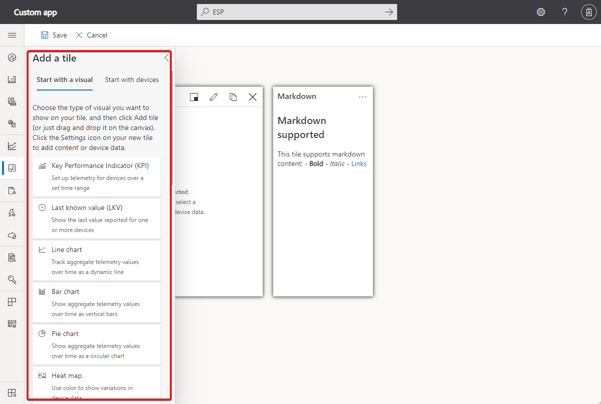
After you create the dashboard, choose items from the library to add to the dashboard. The library contains the tiles and dashboard primitives you use to customize the dashboard:
If you're an administrator, you can create a personal dashboard or an organization dashboard. Users see the organization dashboards associated with the organization they're assigned to. All users can create personal dashboards, visible only to themselves.
Tip
You need to have at least one device template in your application to be able to add tiles that show device information.
Manage dashboards
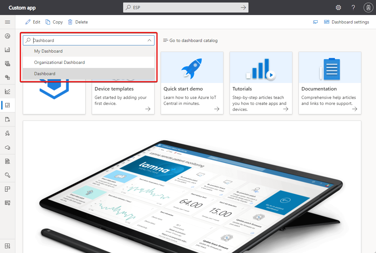
You can have several personal dashboards and switch between them or choose from one of the organization dashboards:
You can edit your personal dashboards and delete dashboards you don't need. If you have the correct permissions, you can edit or delete organization dashboards as well.
You can also manage the dashboards in the catalog by selecting Go to dashboard catalog.
Add tiles
To customize the current dashboard, select Edit.
After you select Edit, the dashboard is in edit mode. You can use the tools in the Add a tile panel to add tiles to the dashboard. You can customize and remove tiles on the dashboard itself. For example, to add a line chart tile to track telemetry values reported by one or more devices over time:
Select Start with a Visual, Line chart, and then Add tile, or just drag the tile onto the canvas.
To edit the tile, select its pencil icon. Enter a Title and select a Device Group. In the Devices list, select the devices to show on the tile.
After you select all the devices to show on the tile, select Update.
After you finish adding and customizing tiles on the dashboard, select Save.
Customize tiles
To edit a tile, you need to be in edit mode. The different tile types have different options for customization:
The square button lets you resize the tile.
The pencil button lets you edit the visualization. For example, for a line chart you can choose to show the legend and axes and choose the time range to plot.
The copy button lets you create a duplicate of the tile.
Tile types
This table describes the types of tiles you can add to a dashboard:
| Tile | Description |
|---|---|
| KPI | Display aggregate telemetry values for one or more devices over a time period. For example, you can use them to show the maximum temperature and pressure reached for one or more devices during the past hour. |
| Last known value | Display the latest telemetry values for one or more devices. For example, you can use this tile to display the most recent temperature, pressure, and humidity values for one or more devices. |
| Line chart | Plot one or more aggregate telemetry values for one or more devices over a time period. For example, you can display a line chart to plot the average temperature and pressure of one or more devices during the past hour. |
| Bar chart | Plot one or more aggregate telemetry values for one or more devices over a time period. For example, you can display a bar chart to show the average temperature and pressure of one or more devices during the past hour. |
| Pie chart | Display one or more aggregate telemetry values for one or more devices over a time period. |
| Heat map | Display information, represented in colors, about one or more devices. |
| Event history | Display the events for a device over a time period. For example, you can use them to show all the valve open and valve close events for one or more devices during the past hour. |
| State history | List and display status changes for state telemetry. |
| Event chart | Display telemetry events for one or more devices over a time period. For example, you can use this tile to display properties like the temperature changes for a device. |
| State chart | Plot changes for one or more devices over a time period. For example, you can use this tile to display properties like the temperature changes for a device. |
| Property | Display the current values for properties and cloud properties for one or more devices. For example, you can use this tile to display device properties like the manufacturer or firmware version. |
| Map (property) | Display the location of one or more devices on a map. |
| Map (telemetry) | Display the location of one or more devices on a map. You can also display up to 100 points of a device's location history. For example, you can display a sampled route of where a device went in the past week. |
| Image (static) | Display a custom image and can be clickable. The URL can be a relative link to another page in the application or an absolute link to an external site. |
| Label | Display custom text on a dashboard. You can choose the size of the text. Use a label tile to add relevant information to the dashboard, like descriptions, contact details, or Help. |
| Markdown | Clickable tiles that display a heading and description text formatted in Markdown. The URL can be a relative link to another page in the application or an absolute link to an external site. |
| External content | Let you load content from an external source. |
| Number of devices | Display the number of devices in a device group. |
| Data explorer query | Display a saved data explorer query |
Currently, you can add up to 10 devices to tiles that support multiple devices.
Customize visualizations
By default, line charts show data over a range of time. The selected time range is split into 50 equally sized partitions. The device data is then aggregated per partition to give 50 data points over the selected time range. If you want to view raw data, you can change your selection to view the last 100 values. To change the time range or to select raw data visualization, use the Display range dropdown in the Configure chart panel.
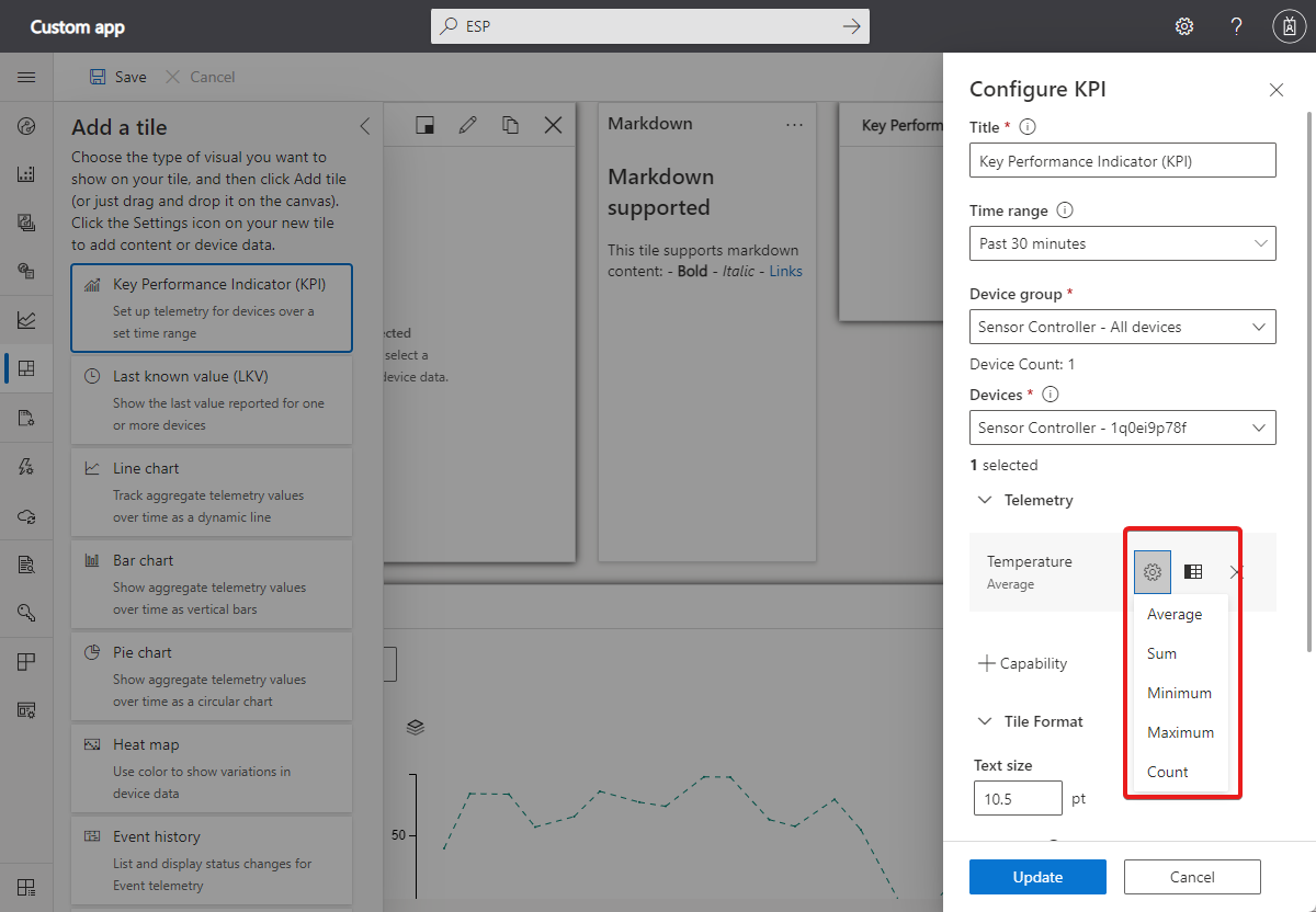
For tiles that display aggregate values, select the gear button next to the telemetry type in the Configure chart panel to choose the aggregation. You can choose average, sum, maximum, minimum, or count:
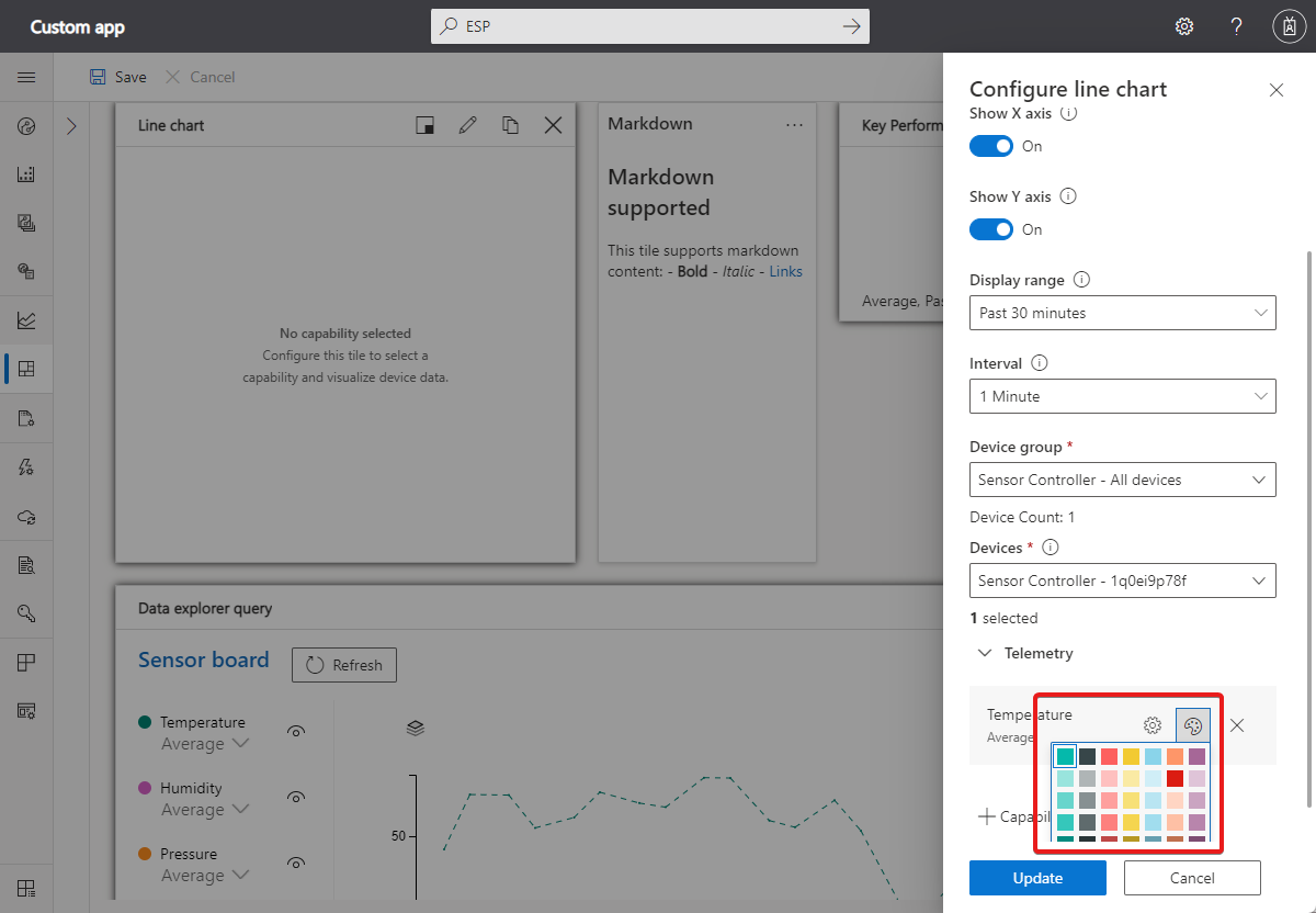
For line charts, bar charts, and pie charts, you can customize the colors of the various telemetry values. Select the palette button next to the telemetry you want to customize:
For tiles that show string properties or telemetry values, you can choose how to display the text. For example, if the device stores a URL in a string property, you can display it as a clickable link. If the URL references an image, you can render the image in a last known value or property tile. To change how a string displays, select the gear button next to the telemetry type or property in the tile configuration.
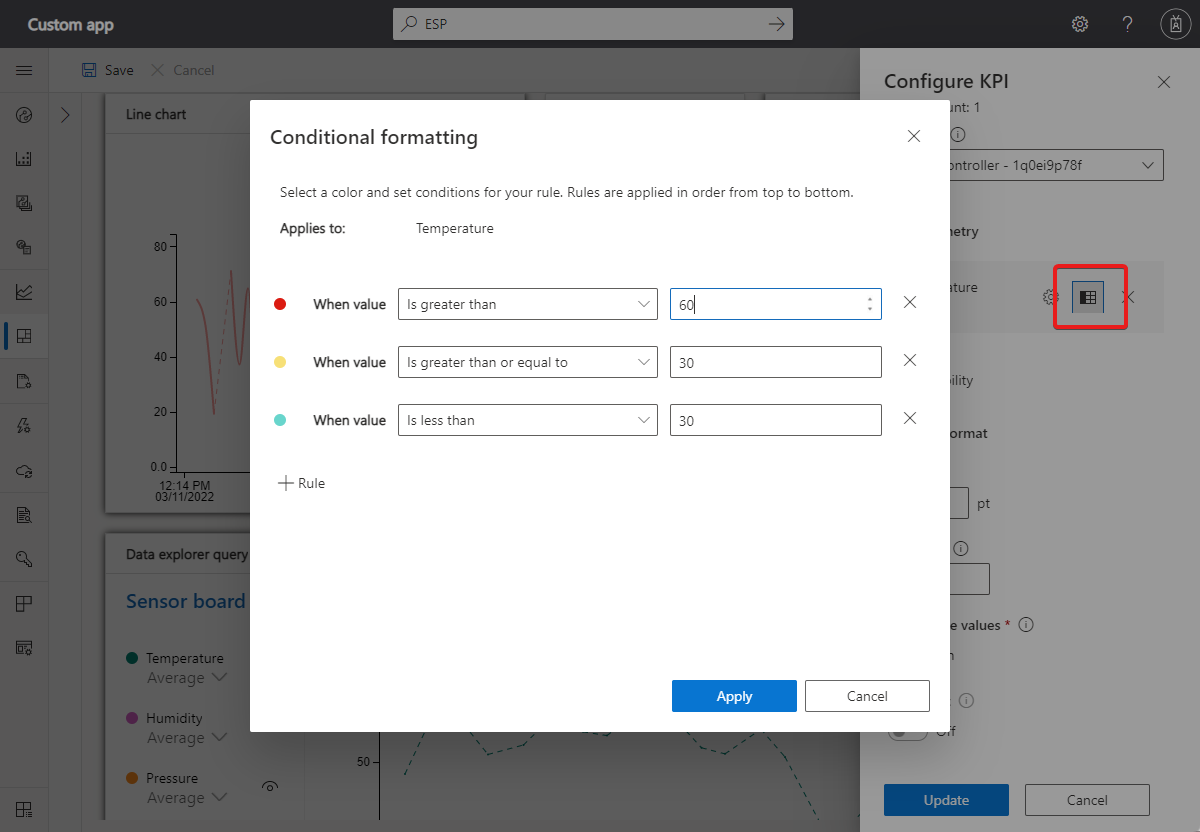
For numeric KPI, LKV, and property tiles, you can use conditional formatting to customize the color of the tile based on its value. To add conditional formatting, select Configure on the tile and then select the Conditional formatting button next to the value you want to customize.
Next, add your conditional formatting rules:
Tile formatting
This feature is available on the KPI, LKV, and property tiles. It lets you adjust font size, choose decimal precision, abbreviate numeric values (for example, format 1,700 as 1.7 K), or wrap string values on their tiles.
Pin data explorer query to dashboard
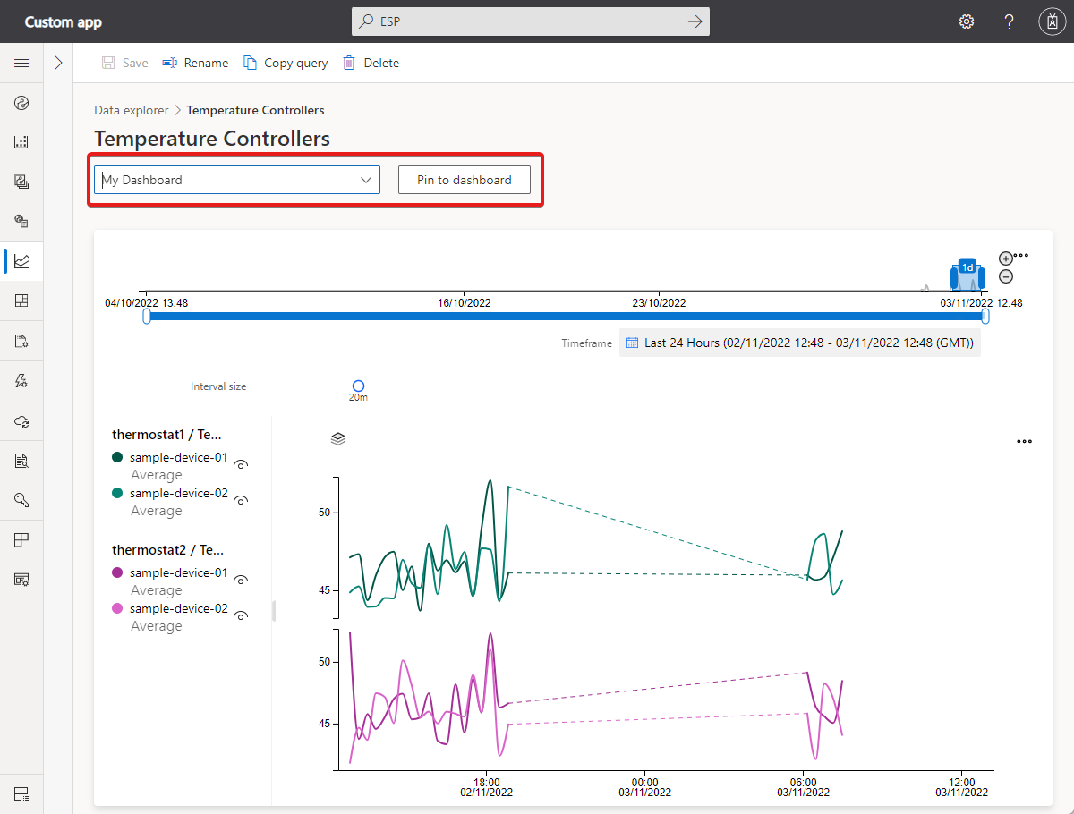
To continuously monitor the data explorer queries, you can pin a query to a dashboard. To pin a query to the dashboard:
- Navigate to Data explorer in the left pane and select a query.
- Select a dashboard from the dropdown menu and select Pin to dashboard.
Next steps
Now that you've learned how to create and manage personal dashboards, you can learn how to manage your application preferences.
Feedback
Coming soon: Throughout 2024 we will be phasing out GitHub Issues as the feedback mechanism for content and replacing it with a new feedback system. For more information see: https://aka.ms/ContentUserFeedback.
Submit and view feedback for
