UI Library Overview
UI Library makes it easy for you to build modern communications user experiences using Azure Communication Services. It gives you a library of production-ready UI components that you can drop into your applications:
Note
For detailed documentation on the Web UI Library visit the Web UI Library Storybook. There you will find additional conceptual documentation, quickstarts and examples.
Composites. These components are turn-key solutions that implement common communication scenarios. You can quickly add video calling or chat (currently only available over Web UI Library) experiences to your applications. Composites are open-source higher-order components built using UI components.
UI Components. These components are open-source building blocks that let you build custom communications experience. Components are offered for both calling and chat capabilities that can be combined to build experiences.
These UI client libraries all use Microsoft's Fluent design language and assets. Fluent UI provides a foundational layer for the UI Library and is actively used across Microsoft products.
In conjunction to the UI components, the UI Library exposes a stateful client library for calling and chat. This client is agnostic to any specific state management framework and can be integrated with common state managers like Redux or React Context. This stateful client library can be used with the UI Components to pass props and methods for the UI Components to render data. For more information, see Stateful Client Overview.
Note
The same components and composites offered in the UI Library are available in the Design Kit for Figma, so you can quickly design and prototype your calling and chat experiences.
Composites overview
Composites are higher-level components composed of UI components that deliver turn-key solutions for common communication scenarios using Azure Communication Services. Developers can easily instantiate the Composite using an Azure Communication Services access token and the required configuration attributed for call or chat.
| Composite | Use Cases |
|---|---|
| CallwithChatComposite | Experience combining calling and chat features to allow users to start or join a call and chat thread. In the experience, the user has the ability to both communicate using voice and video, and access to a rich chat thread where messages can be exchanged between participants. It includes support for Teams Interop. |
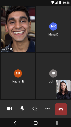
| CallComposite | Calling experience that allows users to start or join a call. Inside the experience users can configure their devices, participate in the call with video, and see other participants, including those participants with video turn-on. For Teams Interop, is included lobby functionality for user to wait to be admitted. |
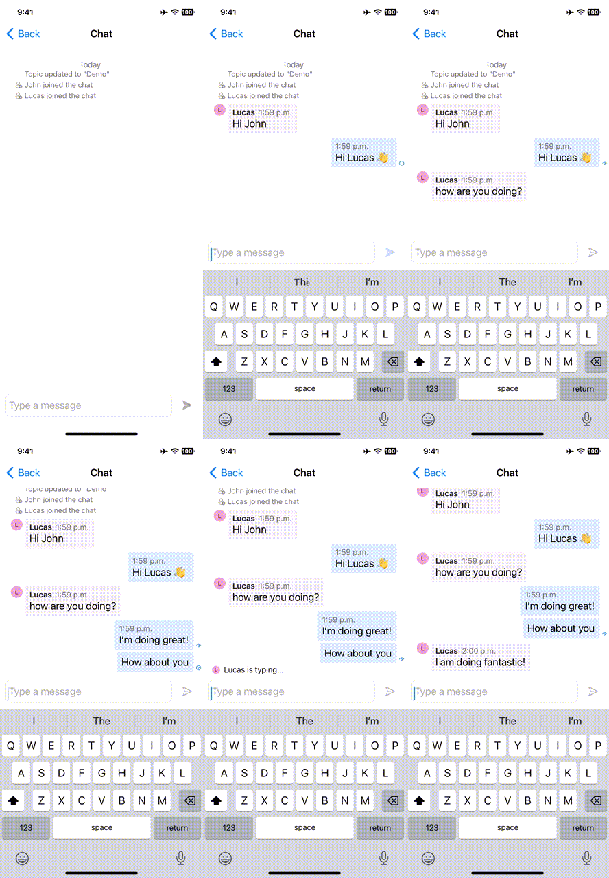
| ChatComposite | Chat experience where user can send and receive messages. Thread events like typing, reads, participants entering and leaving are displayed to the user as part of the chat thread. |
UI Component overview
Pure UI Components can be used for the developers, to compose communication experiences, from stitching video tiles into a grid to showcase remote participants, to organizing components to fit your applications specifications. UI Components support customization to give the components the right feel and look to match an applications branding and style.
| Area | Component | Description |
|---|---|---|
| Calling | Grid Layout | Grid component to organize Video Tiles into an NxN grid |
| Video Tile | Component that displays video stream when available and a default static component when not | |
| Control Bar | Container to organize DefaultButtons to hook up to specific call actions like mute or share screen | |
| VideoGallery | Turn-key video gallery component, which dynamically changes as participants are added | |
| Dialpad | Component to support phone number input and DTMF tones | |
| Chat | Message Thread | Container that renders chat messages, system messages, and custom messages |
| Send Box | Text input component with a discrete send button | |
| Rich Text Send Box | Rich text input component with formatting options and a discrete send button | |
| Message Status Indicator | Multi-state read receipt component to show state of sent message | |
| Typing indicator | Text component to render the participants who are actively typing on a thread | |
| Common | Participant Item | Common component to render a call or chat participant including avatar and display name |
| Participant List | Common component to render a call or chat participant list including avatar and display name |
Installing Web UI Library
Stateful clients are found as part of the @azure/communication-react package.
npm i --save @azure/communication-react
What UI artifact is best for my project?
Understanding these requirements help you choose the right client library:
- How much customization do you desire? Azure Communication core client libraries don't have a UX and are designed so you can build whatever UX you want. UI Library components provide UI assets at the cost of reduced customization.
- What platforms are you targeting? Different platforms have different capabilities.
Details about feature availability in the UI Library is available here, but key trade-offs are summarized in the next table.
| Client library / SDK | Implementation Complexity | Customization Ability | Calling | Chat | Teams Interop |
|---|---|---|---|---|---|
| Composite Components | Low | Low | ✔ | ✔ | ✔ |
| Base Components | Medium | Medium | ✔ | ✔ | ✔ |
| Core client libraries | High | High | ✔ | ✔ | ✔ |
Composites are turn-key solutions that implement common communication scenarios. You can add video calling experiences to your applications. Composites are open-source higher-order components that developers can take advantage of to reduce development time and engineering complexity.
Composites overview
| Composite | Use Cases |
|---|---|
| CallComposite | Calling experience that allows users to start or join a call. Inside the experience, users can configure their devices, participate in the call with video, and see other participants, including those ones with video turned on. For Teams interoperability, CallComposite includes lobby functionality so that users can wait to be admitted. |
| ChatComposite | The ChatComposite brings a real-time text messaging experience to users. Specifically, users can send and receive a chat message with events from typing indicators and read receipt. In addition, users can also receive system messages such as participant added or removed and changes to chat title. |
Composites scenarios for calling
Joining a video/audio call
Users can join a call using the Teams meeting URL or they can set up an Azure Communication Services Call. This approach offers a simpler experience, just like the Teams application.

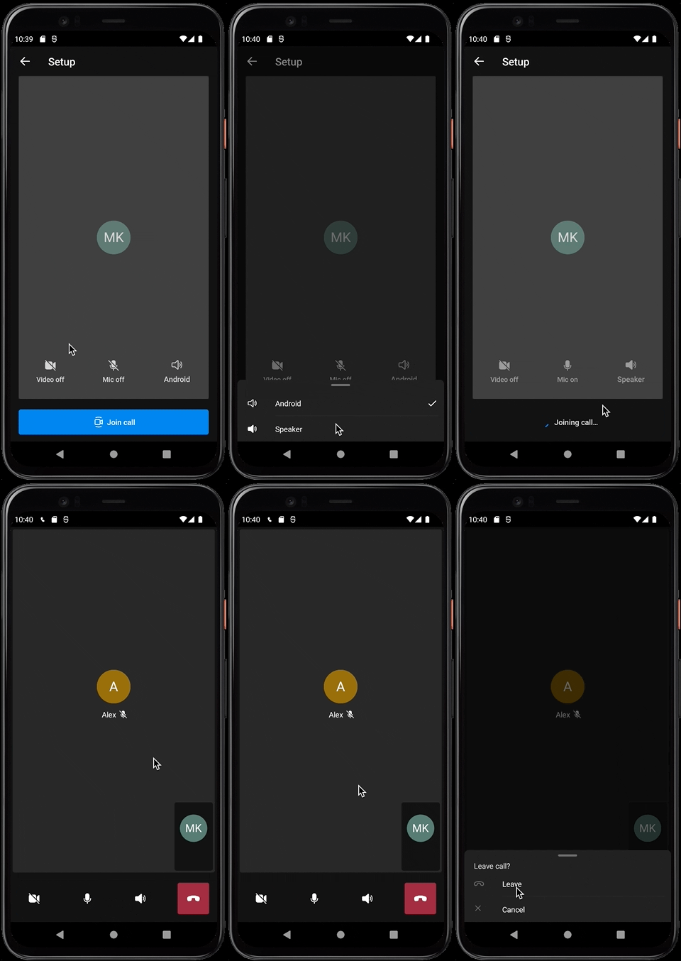
Pre-call experience
As a participant of the call, you can provide a name and set up a default configuration for audio and video devices. Then you're ready to jump into the call.

Call experience
The calling composite provides an end-to-end experience, optimizes development time, and focuses on clean layout.

The calling experience provides all these capabilities in one composite component, providing a clear path without complex code, which leads to faster development time.
Quality and security
Mobile composites for calling are initialized using Azure Communication Services access tokens.
More details
If you need more details about mobile composites for calling, see use cases.
Composites scenarios for chat
Important
This feature of Azure Communication Services is currently in preview.
Preview APIs and SDKs are provided without a service-level agreement. We recommend that you don't use them for production workloads. Some features might not be supported, or they might have constrained capabilities.
For more information, review Supplemental Terms of Use for Microsoft Azure Previews.
Chat experience
The ChatComposite delivers real time text messaging experiences. With the flexibility and scalability in mind, the ChatComposite can adapt to different layout or views from your applications without complexibility. You could also choose to not have the ChatComposite view shown and only receive notifications to meet your different business needs.
| iOS | Android |
|---|---|

|

|
Quality and security
Similar to the CallComposite, the ChatComposite also utilizes Azure Communication Services access tokens. To ensure only users with appropriate permission can access chat, their user tokens need to be added into a valid chat thread prior to starting the Chat experience.
More details
If you need more details about mobile composites for chat, see use cases.
What UI artifact is best for my project?
These requirements help you choose the right client library:
How much customization do you desire? Azure Communication Services core client libraries don't have a UX and are designed so you can build whatever UX you want. UI Library components provide UI assets at the cost of reduced customization.
What platforms are you targeting? Different platforms have different capabilities.
Here are some key trade-offs:
| Client library / SDK | Implementation complexity | Customization ability | Calling | Chat | Teams interoperability |
|---|---|---|---|---|---|
| Composite Components | Low | Low | ✔ | ✔ | ✔ |
| Core client libraries | High | High | ✔ | ✔ | ✔ |
For more information about feature availability in the UI Library, see UI Library use cases.
Known issues
Feedback
Coming soon: Throughout 2024 we will be phasing out GitHub Issues as the feedback mechanism for content and replacing it with a new feedback system. For more information see: https://aka.ms/ContentUserFeedback.
Submit and view feedback for