Understand forecast projections by using trend charts
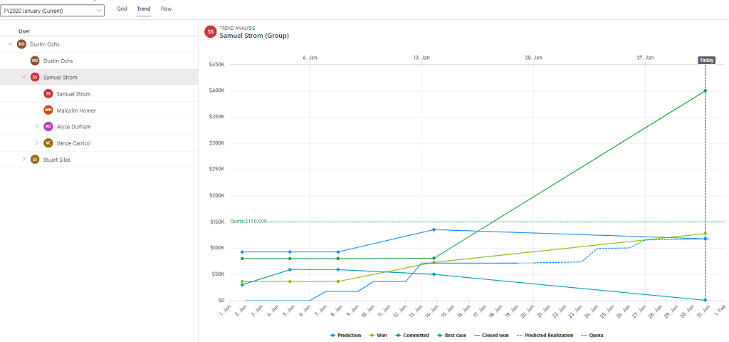
The Trend chart shows how each forecast amount is trending over time, comparing it against the period end prediction and quota. A separate predicted realization line is automatically created to project future revenue over time.
Note
The Trend chart is available as part of the predictive forecasting feature. Verify that predictive forecasting is enabled for your organization. To learn more, see About premium forecasting.
License and role requirements
| Requirement type | You must have |
|---|---|
| License | Dynamics 365 Sales Premium More information: Dynamics 365 Sales pricing |
| Security roles | Any primary sales role, such as salesperson or sales manager More information: Primary sales roles |
View trend charts
Sign in to the Sales Hub app.
At the bottom of the site map, select the Change area icon, and then select Sales.
Under Performance, select Forecasts.
Select a forecast, and choose a forecast period for the forecast.
Select the Trend tab.
A line chart is displayed with the comparison between the forecast categories until the present day.
Understand trend charts
Note
Columns available for trending can be configured in the forecast configuration. To learn more, see configure columns.
The following screenshot shows an example of a trend chart.

The categories displayed on the trend chart depend on the forecast grid columns that your administrator has configured and the prediction columns. For more information on configuring forecast grid columns, see Configure columns.
Note
The Predicted Realization line indicates the combined value of Predicted from open and Predicted from new. For more information on prediction columns, see Analyze revenue outcome by using predictive forecasting.
When you hover over a forecast category in the legend, the trend line of the forecast category gets highlighted.
You can also view the summary of a forecast category at a given time by hovering over the trend line. The summary displays the date, forecast category, and aggregated opportunity amount.
If you don't want to view any forecast category on the chart, select the forecast category on the legend and the forecast category will be grayed out. To view it again on the chart, select the forecast category.
Can't find the options in your app?
There are three possibilities:
- You don't have the necessary license or role.
- Your administrator hasn't turned on the feature.
- Your organization is using a custom app. Check with your administrator for exact steps. The steps described in this article are specific to the out-of-the-box Sales Hub and Sales Professional apps.
See also
Analyze revenue outcome by using predictive forecasting
About premium forecasting
Feedback
Coming soon: Throughout 2024 we will be phasing out GitHub Issues as the feedback mechanism for content and replacing it with a new feedback system. For more information see: https://aka.ms/ContentUserFeedback.
Submit and view feedback for